Mural Showdown!
I have been racking my brain over the mural lately. What color. What design. I think i will have it,and then I'll get another idea. I had it figured out, but then my friend Bonnie says, "so basically you got 3 upside down peace signs squinched together."
Yeah, thats what I got. I couldnt shake that thought. That I was subliminaly trying to make my kid a hippie. So i started looking at the mural, and I was like...these dont even look like trees. they look like wheat or something.
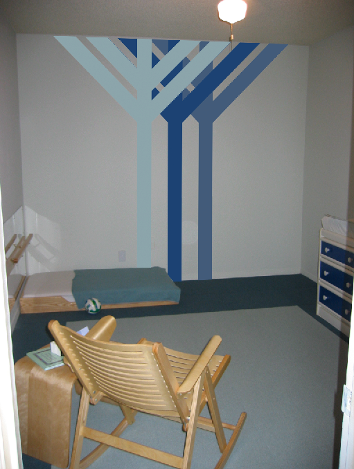
Three pieces of wheat.
So then this next design comes to me...
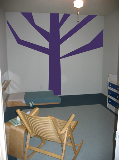
And I decide to do it in purple. So after looking at the swatchbook forever trying to decide on which purple to go with I decide that this is the design, and purple is the color. So today I head down to ecowise and pick up the paint. Then its off to see my friend Bonnie who's going to give me some pointers and tools to help me out. I break down the project for her, and tell her how i originally was going to do two trees that i saw in an issue of Wallpaper a long time ago. She asks to see a sketch. So I sketch it out, and the sketch looks really good, and bonnie likes it.
So now I'm like, "great! now I'm thinking I should do this!" So i go home and start sketching it out on the computer. Now my friend Amy had tracked the actual issue of Wallpaper for me when she heard that I was desperattly in search of these trees. She scanned the pic and sent it my way, but i had already designed the "peace sign mural" so i didnt even think about it. But today I did a very similar adaptation of it and i like it a bunch.
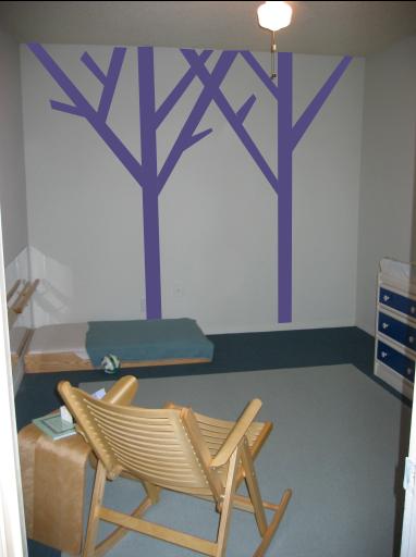
Now i have also been trying to keep in mind whats best for the montessori method. Montessori says that the room has to be soothing and calm and that all decoration should be as life like as possible. Montessori keeps it real! And while tress arent really purple...
Now both of these designs look like trees, i think i have sold myself on the design i came up with today. I was originally going to ask my readers which one they liked most, but i have already decided. I really am liking the 2 trees.
In the morning i will begin!
Yeah, thats what I got. I couldnt shake that thought. That I was subliminaly trying to make my kid a hippie. So i started looking at the mural, and I was like...these dont even look like trees. they look like wheat or something.

Three pieces of wheat.
So then this next design comes to me...

And I decide to do it in purple. So after looking at the swatchbook forever trying to decide on which purple to go with I decide that this is the design, and purple is the color. So today I head down to ecowise and pick up the paint. Then its off to see my friend Bonnie who's going to give me some pointers and tools to help me out. I break down the project for her, and tell her how i originally was going to do two trees that i saw in an issue of Wallpaper a long time ago. She asks to see a sketch. So I sketch it out, and the sketch looks really good, and bonnie likes it.
So now I'm like, "great! now I'm thinking I should do this!" So i go home and start sketching it out on the computer. Now my friend Amy had tracked the actual issue of Wallpaper for me when she heard that I was desperattly in search of these trees. She scanned the pic and sent it my way, but i had already designed the "peace sign mural" so i didnt even think about it. But today I did a very similar adaptation of it and i like it a bunch.

Now i have also been trying to keep in mind whats best for the montessori method. Montessori says that the room has to be soothing and calm and that all decoration should be as life like as possible. Montessori keeps it real! And while tress arent really purple...
Now both of these designs look like trees, i think i have sold myself on the design i came up with today. I was originally going to ask my readers which one they liked most, but i have already decided. I really am liking the 2 trees.
In the morning i will begin!

2 Comments:
Love the new trees. Are you going to vary the shades like in the original sketch, the peace trees sketch? Give a sense of depth. Love what you are doing with the nursery! Have fun!!!!
i just realized you could leave comments. now i'll have to go back and add a few :) i totally love the new trees! super cool! i was thinking if you wanted to keep it more "real" the dark amber color on two of the balls on the clock would look cool(good w/ blue). by the way, i love the clock! It's must have for breastfeeding. i also like the idea of two different shades for the trees, any which way they will look great. the nursery looks beautiful! can't wait to see it with baby g in it! :)
Post a Comment
<< Home